My BLink column this month:
Whether they’re swiped or free or paid for, there’s something about film posters that I’ve always loved... they capture something essential about the film, in a medium so different.
 But what I think makes for the most marvellous posters, really, is text used either alone, or in conjunction with images. Dev D’s posters incorporated some phrases from the film’s songs: ‘Emotional Atyachar’ appeared bookended by the bandwallas who played it, ‘Ek Hulchul’ emerged in a spiral of smoke from Chanda’s (Kalki Koechlin’s) smouldering cigarette. But very little use is made of typography even in these designs. The only recent example of a recent poster with attention to type that I can remember offhand is English Vinglish, which did the obvious well, by placing a Devanagari ‘ga’ and ‘sha’ in place of ‘g’ and ‘sh’, effectively highlighting both the Indianness of the title and the film’s linguistic theme.
Whether they’re swiped or free or paid for, there’s something about film posters that I’ve always loved... they capture something essential about the film, in a medium so different.
Recently, a friend asked me if I had ever stolen books. It was a casual question, but clearly also a challenge, a gauntlet thrown down to test just how low I lay in the good girl stakes. Well, I had to confess I’ve never stolen a book. Then, searching for a chink in the boring middle-class moral carapace that clearly covers me, I came up with the only things I’ve ever stolen: food from a college pantry — and film posters.
Regardless of whether they’re swiped or free or paid for, there’s something about film posters that I’ve always loved. Maybe it’s the way in which they capture something essential about a film, in a medium so different from it. No matter how much one might love a film, it unfolds in time, and at its own pace. Imagine running a film nonstop in your living room as the background to your life! But the poster which picks out one moment from a film, arresting that flow of time that defines the medium — that can stay on my wall forever, and each time I look at it, it is possible to have it evoke the series of moments of which it is a part. So many of my favourite posters are often based on a single film still.
For years I had, above my bed, a poster of Matir Moina (The Clay Bird), the late Tareque Masud’s lyrical portrait of a childhood unravelling in the build-up to the Bangladesh War of Liberation. Two young boys in a classroom in skullcaps. One of them is Anu, the film’s protagonist, sent away to a madrasa by his increasingly inflexible, increasingly orthodox father. The other is the sole friend he makes there, the jeered-at ‘mad boy’, Rokon. In the image on the poster, Anu has his mouth open, as if to speak, while Rokon watches him, as if waiting for the tentativeness to dissipate. I haven’t seen the film since 2002, but the image has kept alive in my mind the nervous hesitation of Anu’s first few days at the madrasa — the melancholy, the cramped sleeping spaces, the strict teachers, the mocking classmates.
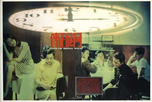
Another poster on my wall, whisked away from outside some film festival, is a lovely one of Wong Kar Wai’s Days of Being Wild. I used to be a fan, and could probably still summon something of my old enthusiasm for Chungking Express, Fallen Angels and Happy Together — despite the unmitigated disaster that was My Blueberry Nights. But I’ve never watched Days of Being Wild. It’s as if the poster has sated my curiosity. The bluish-green tint to it, juxtaposed sharply with the bright red Chinese characters bunched together in the centre; the strangely flattened clock that seems to suggest that time (for being wild?) is running out — the whole thing has a stylised melancholy so typical of Wong Kar Wai’s aesthetic in the ’90s, that it makes me feel like I’ve watched the film.
The mainstream Hindi film poster, no longer painted, has little to separate it from the mainstream Hollywood poster: they share the generic, claustrophobic effect produced when all the ‘designer’ is doing is fitting in the film’s big faces. There are, of course, occasional posters which do more with photographs, if they use them at all. I remember admiring the ones for Dev D, which used a psychedelic palette of bottle green, dark pink and blood red, and tweaked images of the actors into mind-altering forms. There was Mahie Gill reproduced several times to create a butterfly; Abhay Deol’s face morphed out of recognition, with aviators and giant lips; a green Deol viewed through a pink vodka bottle. There was another (my favourite) where Gill and Deol’s profiles were superimposed so that they seemed to share a single eye. It sounds monstrous, but in fact it succeeded in conjuring up a strange sense of stillness, of the merging of souls.
Dibakar Banerjee’s Love Sex Aur Dhokha was another film with strongly conceptual posters. They used the acronym LSD strategically, also producing psychedelic images, each with a scarlet heart placed at the centre. In one, the ‘heart’ was made up of two pairs of entwined feet, suggesting sex. In another, it was a pincushion, suggesting pain. (Caused by the dhokha, naturally.)
But what I think makes for the most marvellous posters, really, is text used either alone, or in conjunction with images. Dev D’s posters incorporated some phrases from the film’s songs: ‘Emotional Atyachar’ appeared bookended by the bandwallas who played it, ‘Ek Hulchul’ emerged in a spiral of smoke from Chanda’s (Kalki Koechlin’s) smouldering cigarette. But very little use is made of typography even in these designs. The only recent example of a recent poster with attention to type that I can remember offhand is English Vinglish, which did the obvious well, by placing a Devanagari ‘ga’ and ‘sha’ in place of ‘g’ and ‘sh’, effectively highlighting both the Indianness of the title and the film’s linguistic theme.
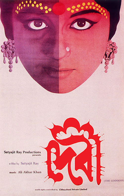
The master of the typographic poster was, of course, Satyajit Ray. Each was more striking than the last. The all-black Joi Baba Felunath poster had no images at all; just the film’s title in plump geometric white, the Bangla letter ‘la’ holding a pistol, from which a shower of sparks emerges to create the only triangle of colour on the page. Shatranj ke Khiladi, using English, created a typeface whose heavy, leaden bottoms evoked the form of the chess piece. The most unforgettable is probably Ray’s poster for Devi (The Goddess), where the eerie energy of Sharmila Tagore’s face, half in shadow and half in blazing light, is echoed by a typescript that seems aflame. The word ‘devi’, in Bangla, forms the crimson outline of a temple. Someday soon, perhaps, I’ll see a new poster as good as that in a cinema — something really worth stealing.
1 comment:
good article
Post a Comment